Role
Product Designer
Project Type
Academic
Tools Used
Sketch, Invision, Illustrator, Marvel
Duration
10 weeks
Summary
Reading the news helps us to stay aware of a number of important social, political and economic issues that directly affect our lives. However, especially in recent times, clicking on a news app can feel like opening up a pandora’s box of issues that feel completely overwhelming and unsolvable. It can be a draining experience and many choose to avoid the news altogether as a result. With this in mind, I set out to create an app that allows users to stay aware and engaged with current events while also reducing news burnout.
The Design Challenge
As I considered possible problem spaces for this project, I was immediately drawn to the topic of news media. In the months preceeding the project, I had been addicted to following political news on Twitter and the topic of fake news a hot button issue. Digital devices had made it easier than ever to spread misinformation to a wide range of viewers, so I reasoned working on digital a solution to address this problem would be helpful.
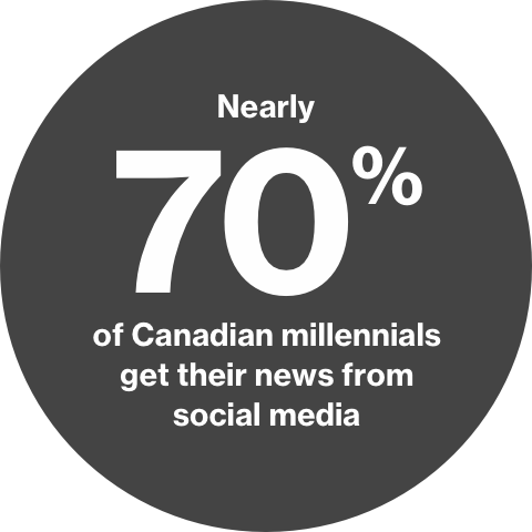
I decided to investigate fake news with a focus on the target demographic of Canadian millennials. They seemed like the perfect demographic to explore this issue since the Canadian Journalism Foundation found that nearly 70% of Canadian millennials get their news from social media - a breeding ground for fake news .
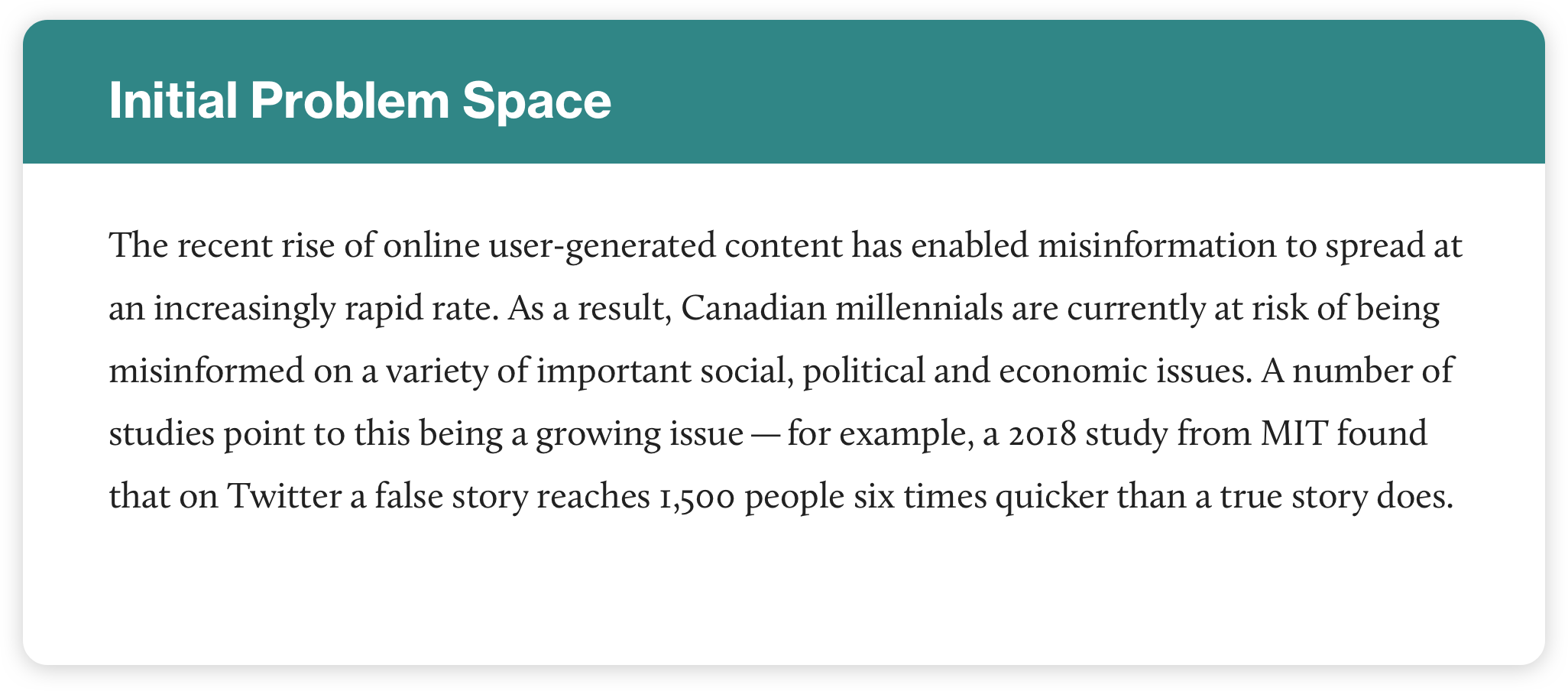
From here, I created my first problem space:
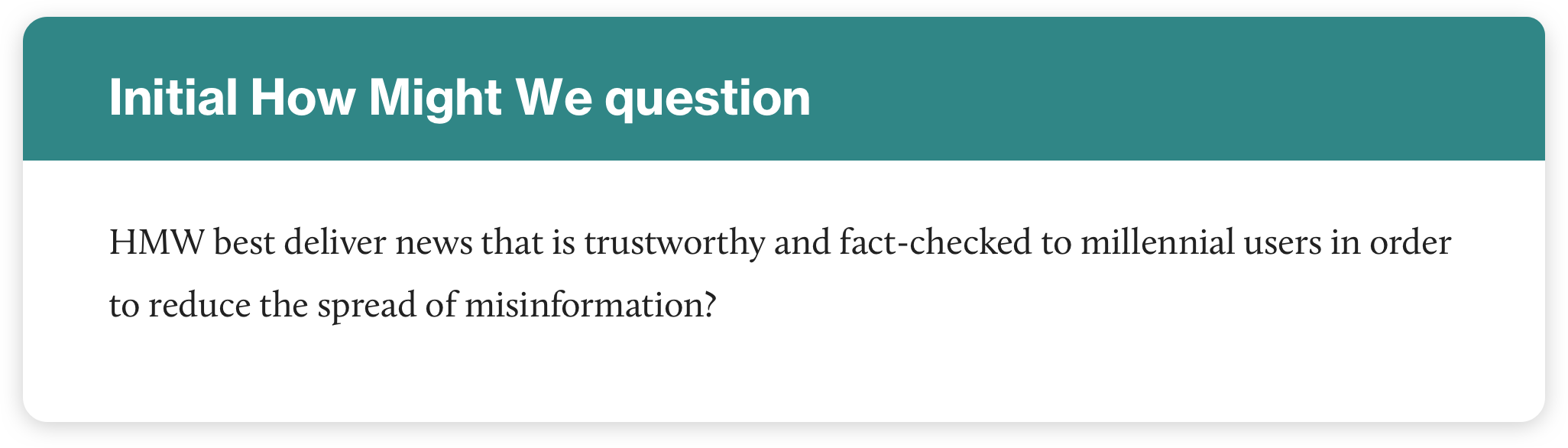
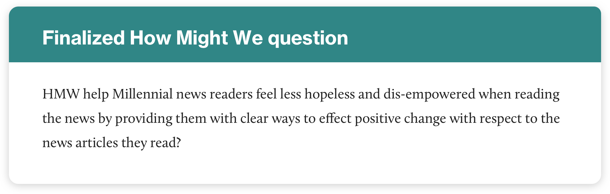
I then crafted a How Might We question to begin tackling the issue:
However, as I continued my research process I discovered many millennial news readers felt they didn’t have an issue discerning between real and fake news online. Their actual pain points were connected to something a little more emotional - news burnout. This led to a shift in problem space from fake news to news burnout, which you’ll learn about in the research summary below.
PHASE 1
Research
I began my secondary research by getting an overview of the current landscape of news media. There were three key issues I discovered:
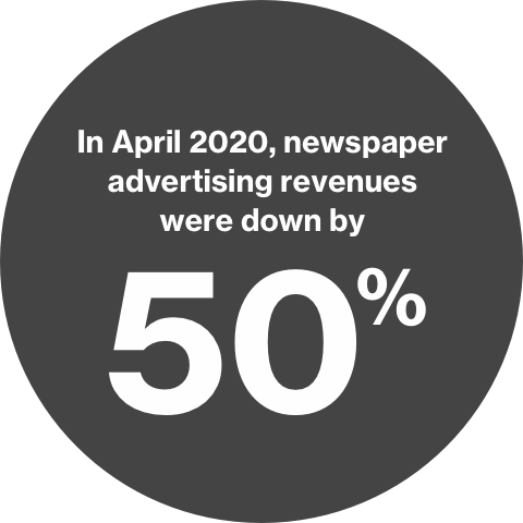
1.) Traditional news media is struggling.
Why is is it struggling? Sean Holman, a journalism professor at Mount Royal University in Calgary, points to newspapers failing to adapt to the new digital landscape and cynically producing “clickbait” stories that only attract views — not loyal readers.
“If your focus is always on getting the story that is going to get big clicks, then that doesn’t leave a lot of room to show readers the kind of value that you can provide from a public interest standpoint,” says Holman. “I think newsroom leaders in this country need to be thinking about how to create communities around their publications that are willing to invest in those publications either as donors or subscribers,”
Source: CBC
2.) News is moving to social media. But is it trustworthy?
A poll commissioned by the Canadian Journalism Foundation and conducted by Maru/Matchbox found some interesting facts about how Canadians are currently getting their news:
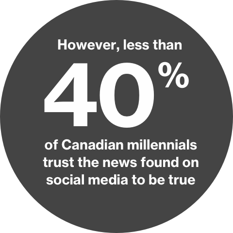
Source: Radio Canada International
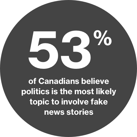
3.) Fake news spreads quicker than real news online
MIT conducted a massive study of 126,000 stories, tweeted by 3 million users, over more than 10 years. Unfortunately, they discovered that fake news was just more more popular than real news. Here are some of the facts:
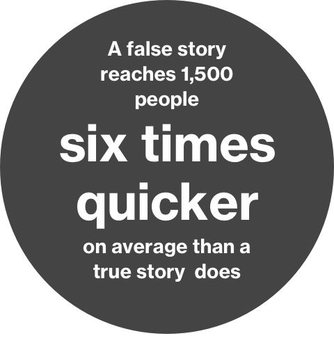
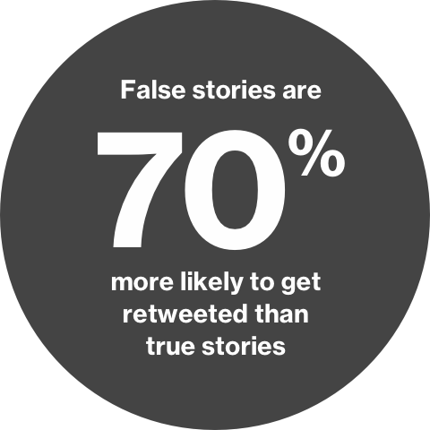
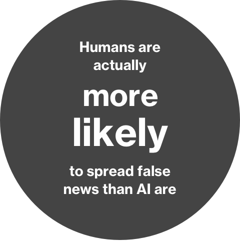
Why is the case? The research team found it was due to two factors. First, false news stories are more novel and unique than true stories. Second, false stories tend to evoke more visceral reactions in their viewers — often feelings like fear and disgust.
Source: The Atlantic
Project Brief
After conducting secondary research, I hammered out a few of the important details I’d have to keep in mind throughout the design process in the form of a brief. This included my objective, target audience, stakeholders and constraints. The specific constraints were as follows:
Technical constraints
• Must be a mobile app solution
• Must be possible from a back-end dev perspective
• The solution cannot be a filter or add-on to an existing app
Business constraints
• The solution would have to attract a large number of users without relying on clickbait/exaggerated headlines
• The product will need to be created within a 10 week time constraint
Socio-Cultural constraints
• Target is Canadian Millennials (ages 22–38)
• Millennials are not as established financially so they may be unwilling to pay for a news subscription
• Millennials prefer getting their news from social media
Assumptions
Next I took some time to consider some of the assumptions I was making about my project, which I'd have to validate or disprove through primary research.
For example, I believed that my users would value trustworthy news as well as cultivating a sense of community centered around the news. I also considered business details - how might this platform might make money? I assumed non-political advertising and an ad-free premium subscription may be some good options.
As well, I thought about risk factors - for example, what if Millennials are only interested in getting their news from social media? I assumed there might be some friction convincing them to use a news app. These were all things I'd have to keep in mind throughout my research.
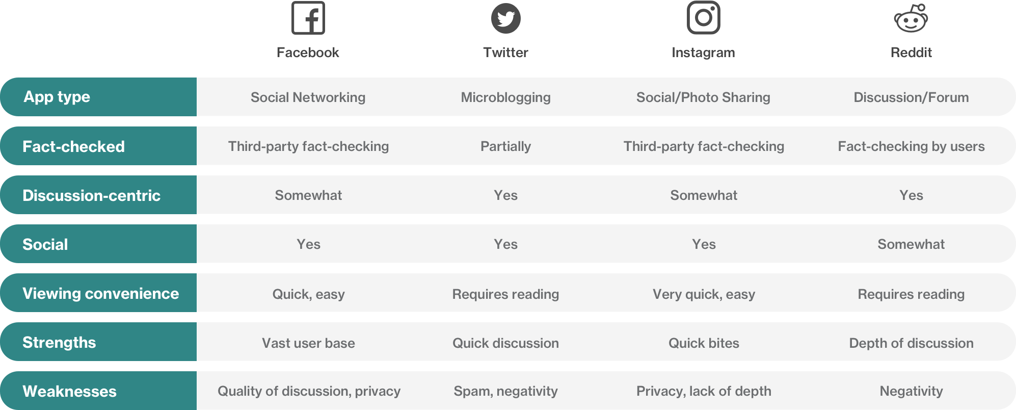
Market & Competitor Research
Since I had established most millennials get their news from social media,
I did a quick rundown of the popular apps they use to get their news:
Research Plan
For my primary research method, I decided to focus on conducting one-on-one interviews with my target users to get a deeper understanding of how Millennials interact with the news in their day to day lives.
The research goal was to talk directly to Canadian Millennials in order to understand whether or not they value reading trustworthy news and if they knew where to find it. I also wanted to understand what news format they most preferred and how they use social media to get informed.
I laid out the granular details such as tasks, schedule/location, particpant criteria, recruitment methods and incentives. From there, all that was left to do was to conduct the interviews.
One-on-one interviews
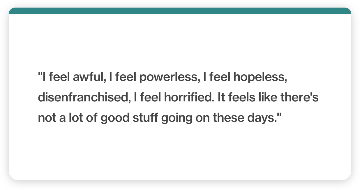
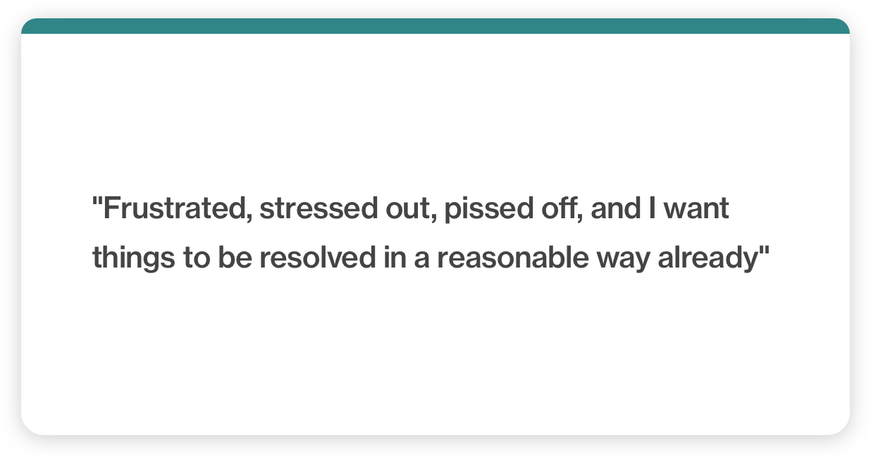
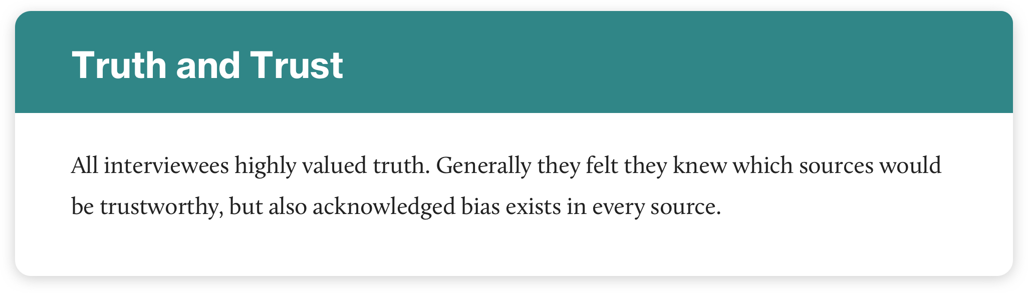
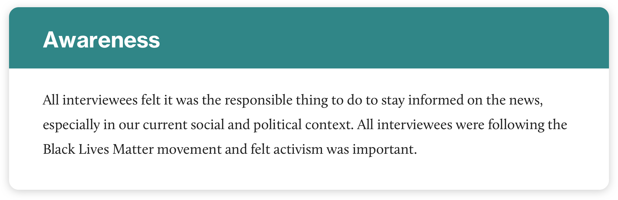
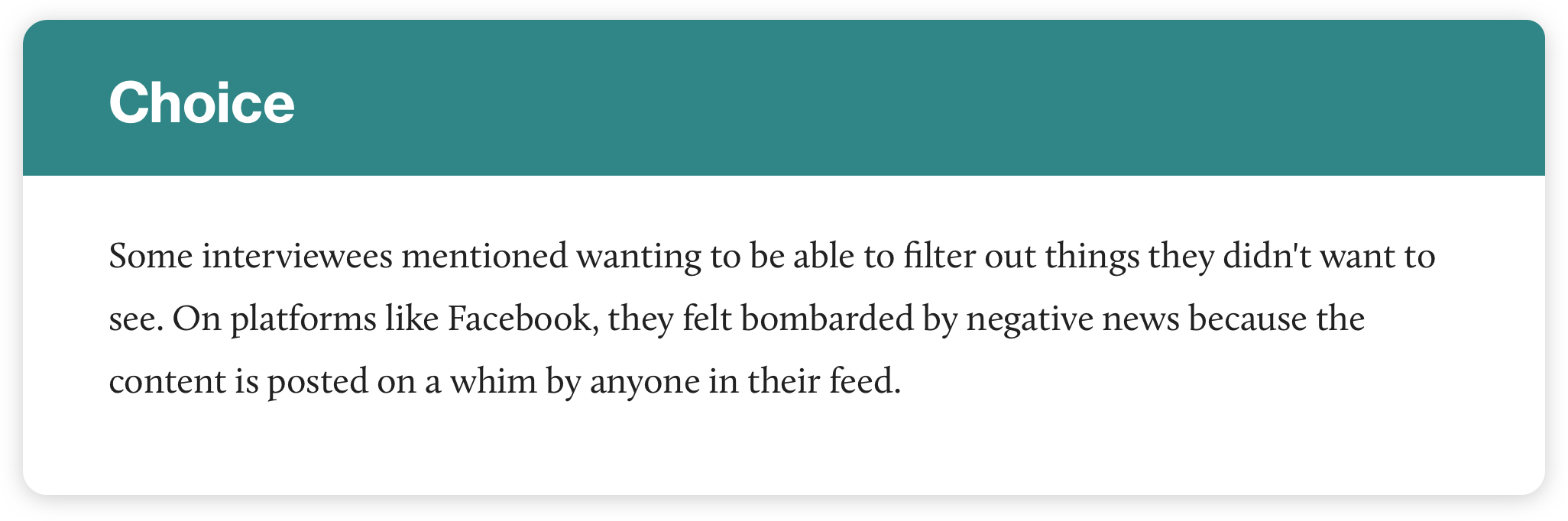
After completing all the interviews, I realized pretty quickly that none of the people I talked to expressed any personal confusion about finding trustworthy news sources — in fact, there were barely any pain points around that topic. However, I noticed that interviewees did express feeling hopeless, angry and powerless when reading about current events, as you can see in the quotes below:
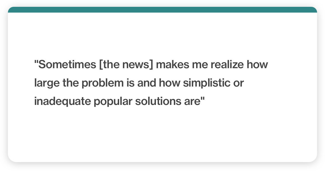
General feelings while reading the news:
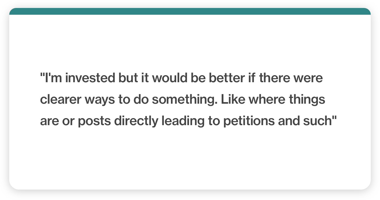
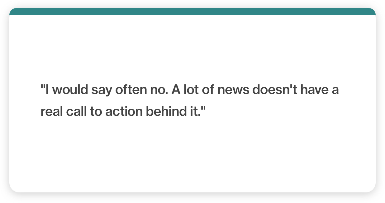
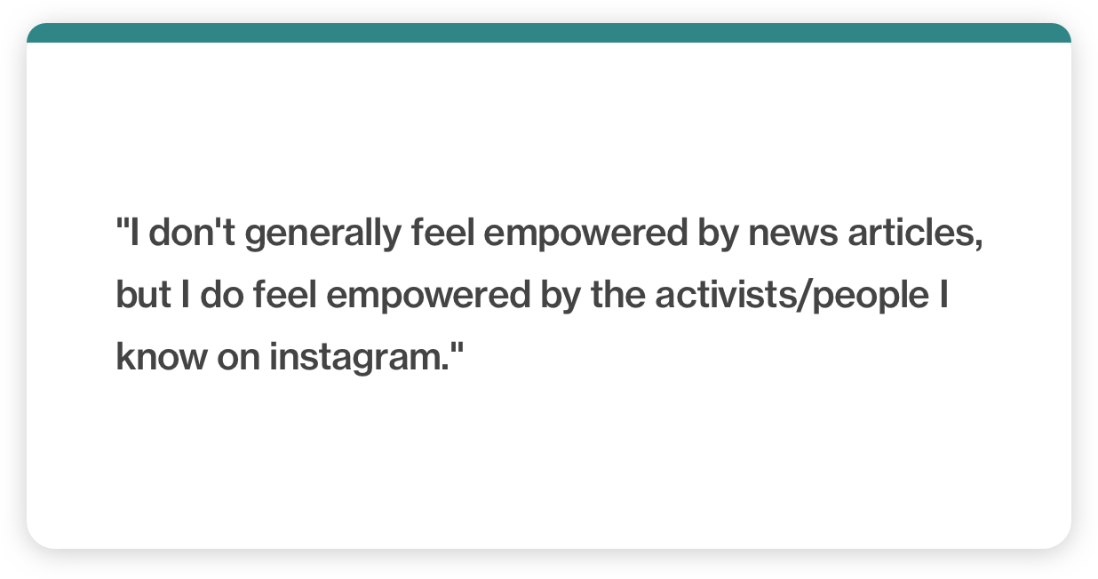
On feeling empowered to take action when reading news articles:
Key research insights
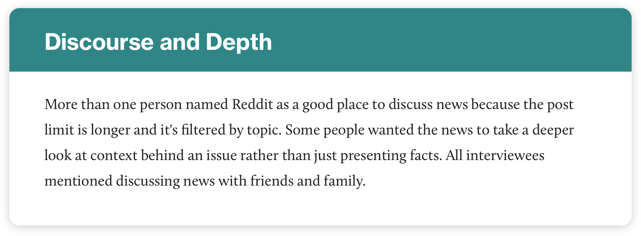
After noting key points from each interview, I sorted all insights into groupings of 5 major themes. Again, you can see visually that most of the pain points (red postits) are clustered in the theme "Hopelessness":
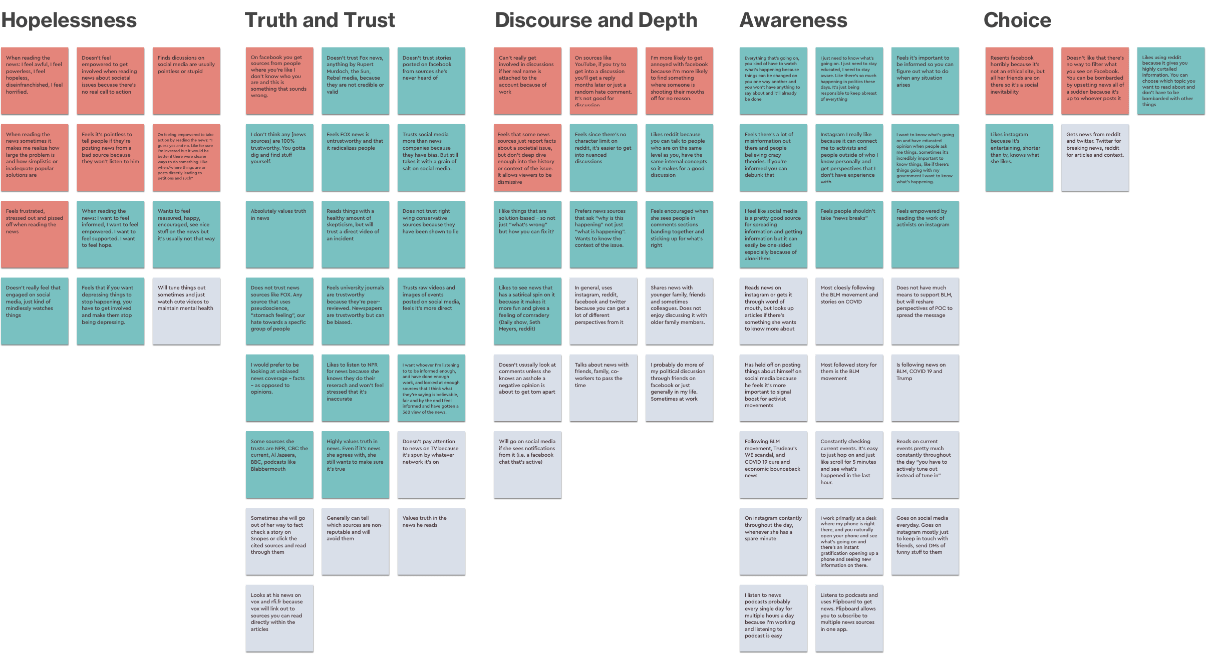
These are the 5 major themes with summarized insights:
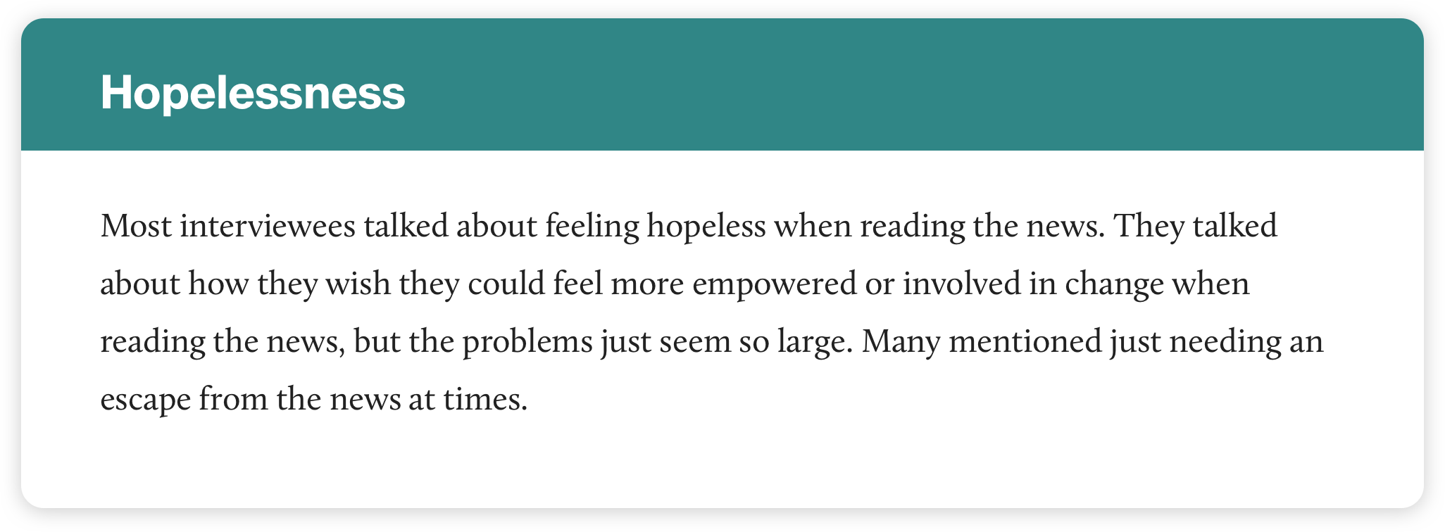
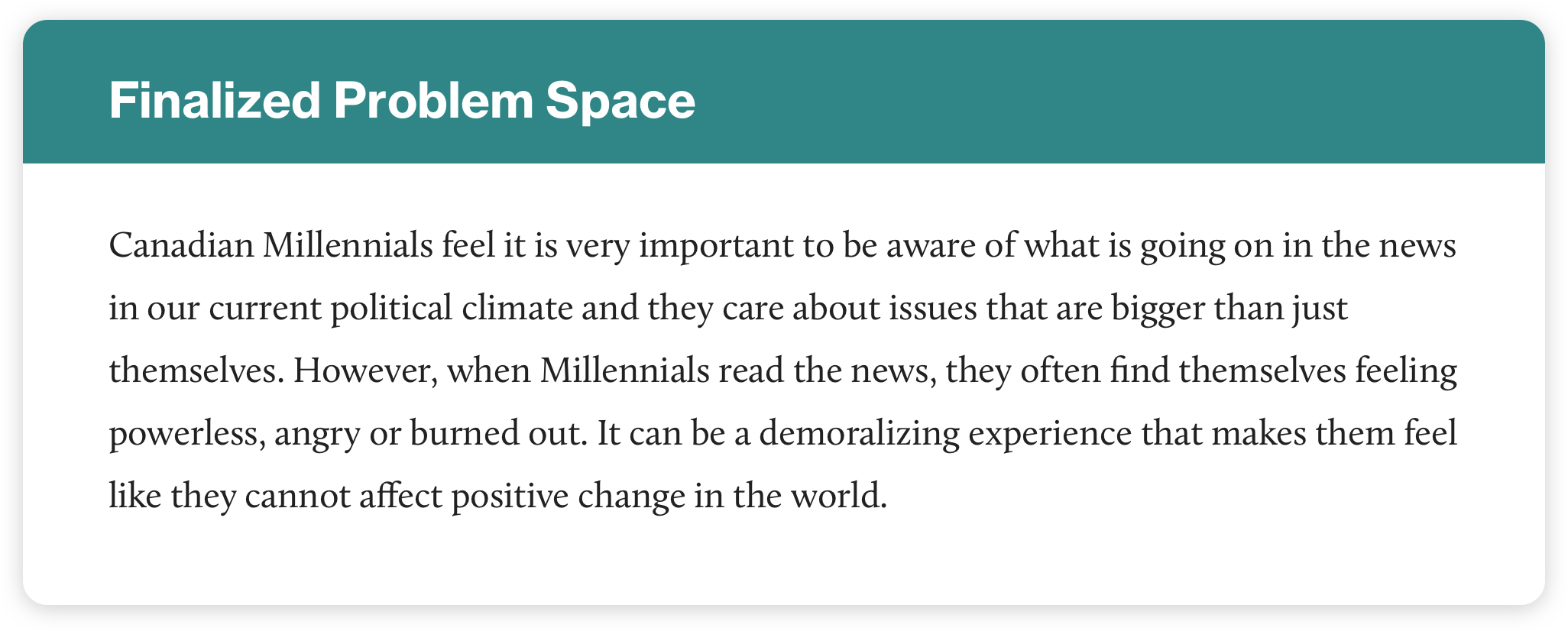
It seemed that of all the themes observed, "Hopelessness" was the most popular. Therefore, this is the theme I chose to shift toward. I crafted an updated Problem space and How Might We question:
PHASE 2
Synthesis
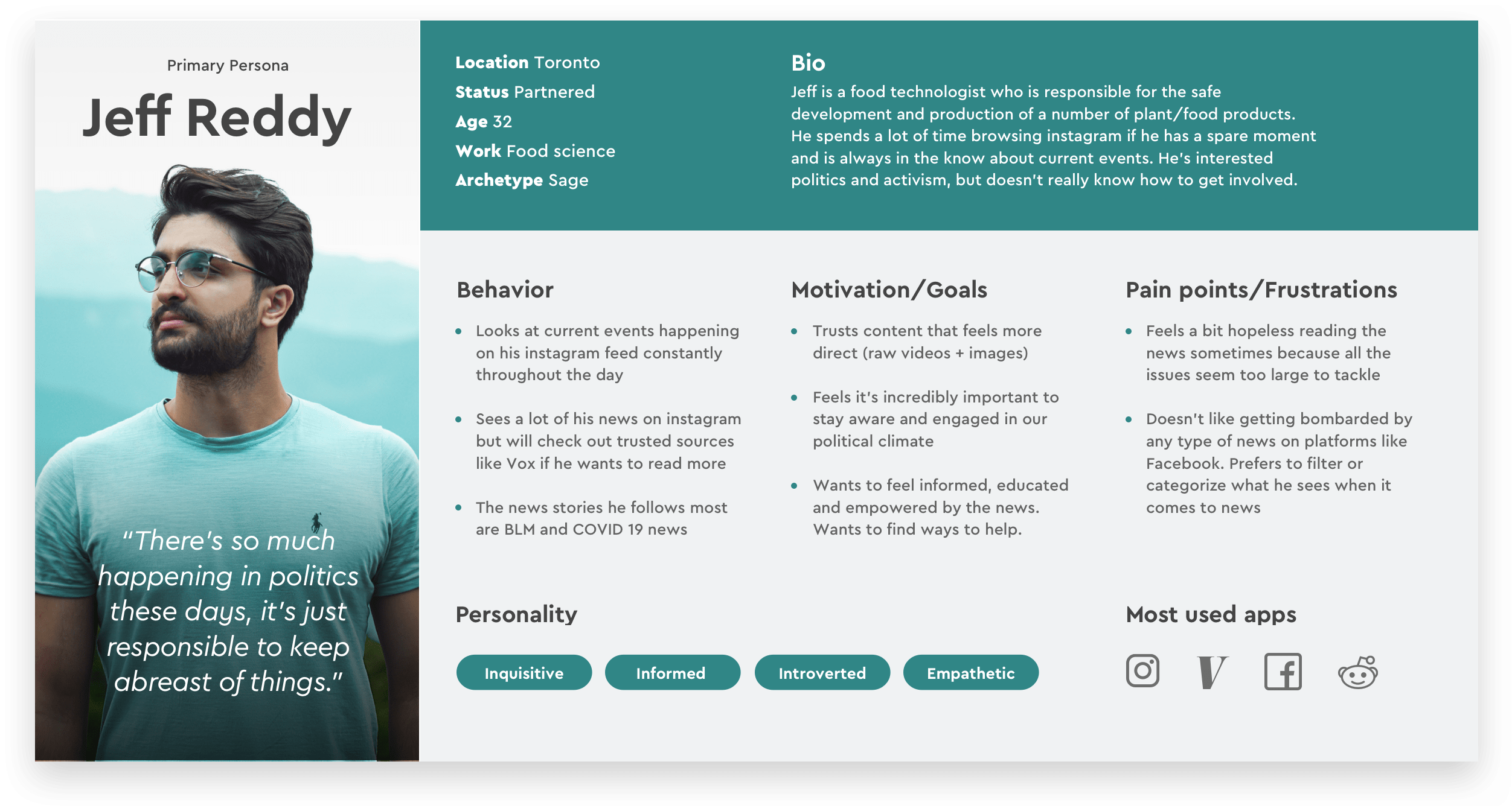
Primary Persona
With the project focus narrowed down, I then created a primary persona to distill my research findings into a succinct representation of the potential user.
Experience Map
Using the primary persona, an experience map was created to understand how our user would feel throughout his journey and to identify possible areas of intervention.
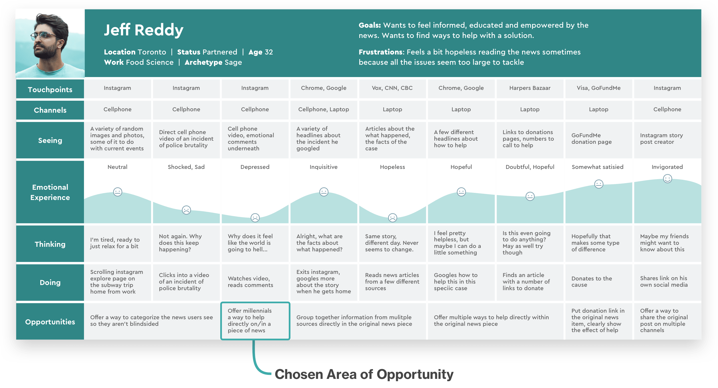
Opportunities for Intervention
There were a number of points within the experience map where an intervention could be made. For the first round of ideation, I honed in on the point at which the user encounters a negative news story. Perhaps the user could be provided with ways to help right in that moment to offset their feelings of helplessness.
PHASE 3
Ideation
Task selection
To begin ideation, I created a series of user stories. Listing out these small representations of the user’s needs allowed me to empathize further with the user’s journey, but it also guided me towards the specific tasks I would need to include in the final product.
At first, I centered around the core epic “Discovering ways to take action regarding the news” and the user story “As a news reader, I want to find ways to help within the news-reading context I can feel a little less hopeless while I get informed on current events”
I created a key task that allowed users to donate to a cause discovered through a news article and even sketched out a task flow that was dedicated to allowing users to donate and sign petitions directly within a news article:
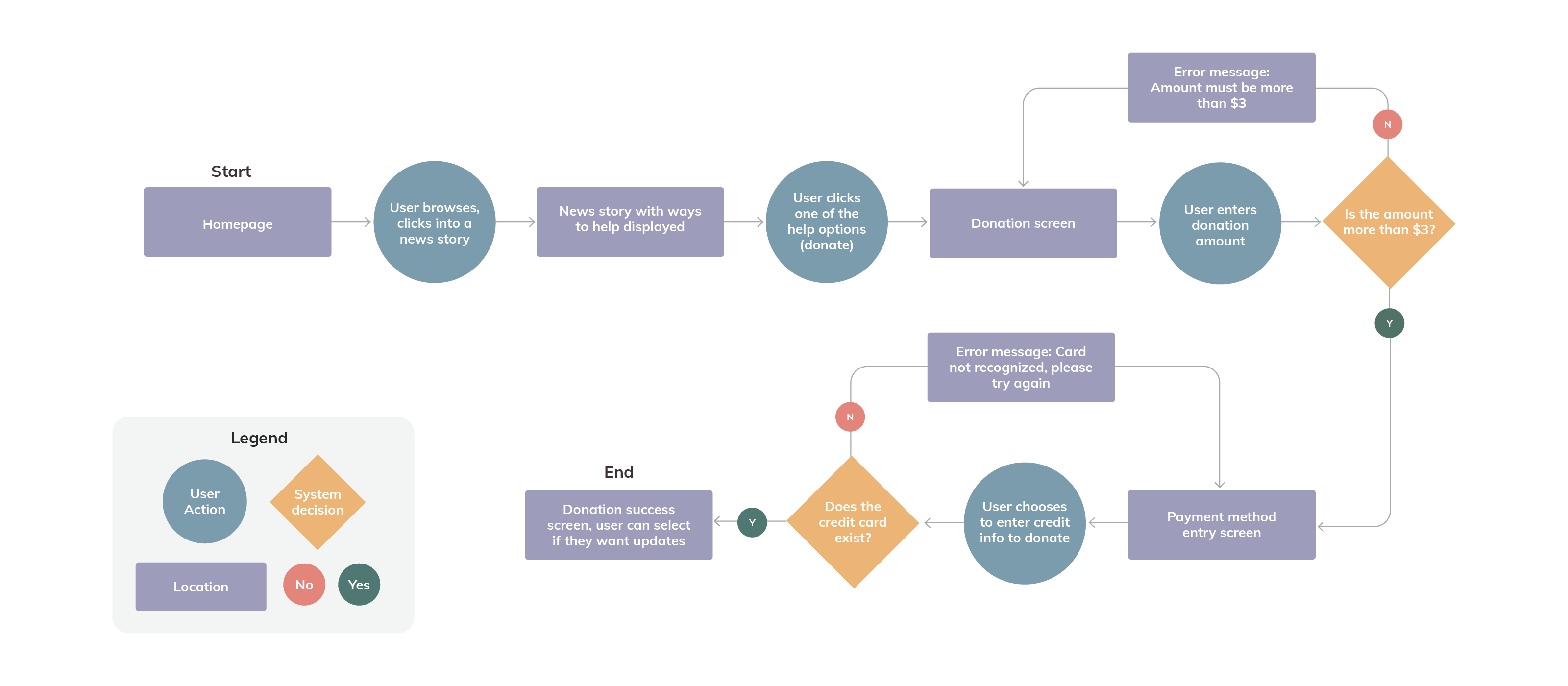
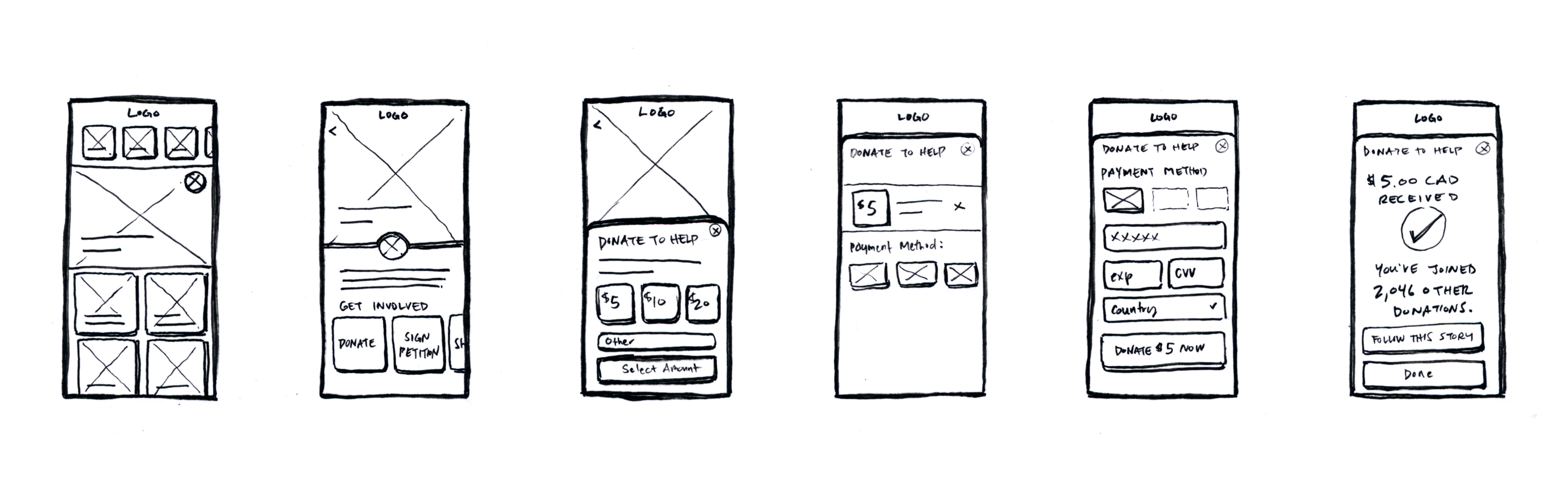
However, while I felt this task could be included in the app, it didn’t seem like it completely addressed the issue of reducing news fatigue. In fact, it might actually make users feel more drained, since donation might add another finanical stress factor.
Reworking the initial task
I returned to secondary research to understand if there was more I could do. It was then that I discovered there was a new school of thought in journalism called “Solutions Journalism”. A journalism training method devised of by columnists working at the New York Times, Solutions Journalism takes the content of news reporting beyond just the issue at hand, and focuses on what is being done to solve the issue effectively.
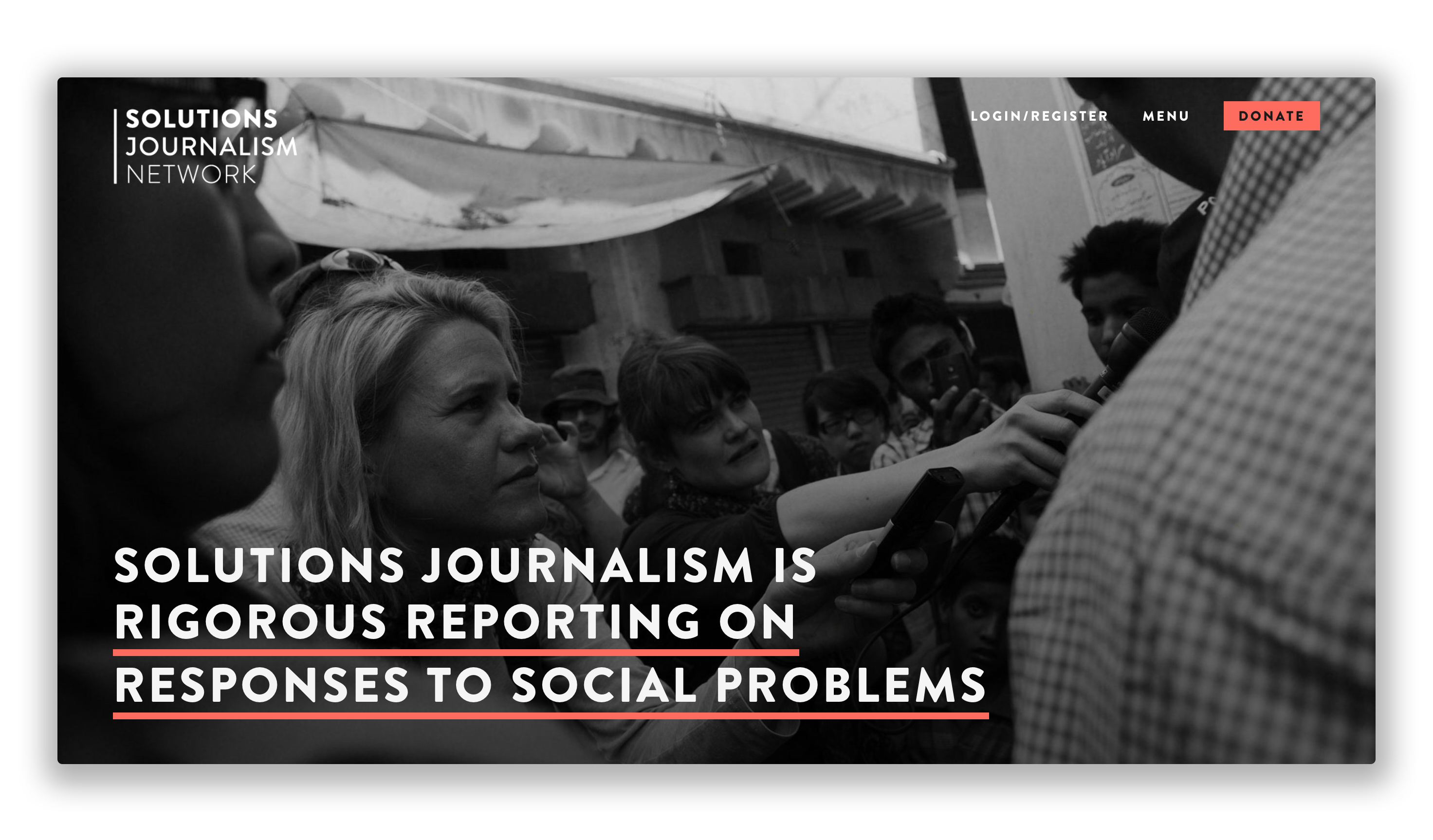
The Solutions Journalism approach to news provided a very interesting salve to the problem of news fatigue. The mission on their website was a nearly perfect answer to my How Might We question:
“Even hard-nosed investigative reporters agree that the news provides an excessively dismal view of the world. Audiences regularly come away from the news — even high quality news — feeling powerless, anxious, and resentful. When the daily news product makes people want to tune out and disengage, it doesn’t bode well for the news business — or for democracy.”
“We help reporters, producers, and editors bring the same attention and rigor to stories about responses to problems as they do to the problems themselves. Doing so, we believe, can elevate public discourse, spur citizen agency, and reduce polarization. It can strengthen democracy. When added to the mix, it improves the overall quality and impact of journalism.”
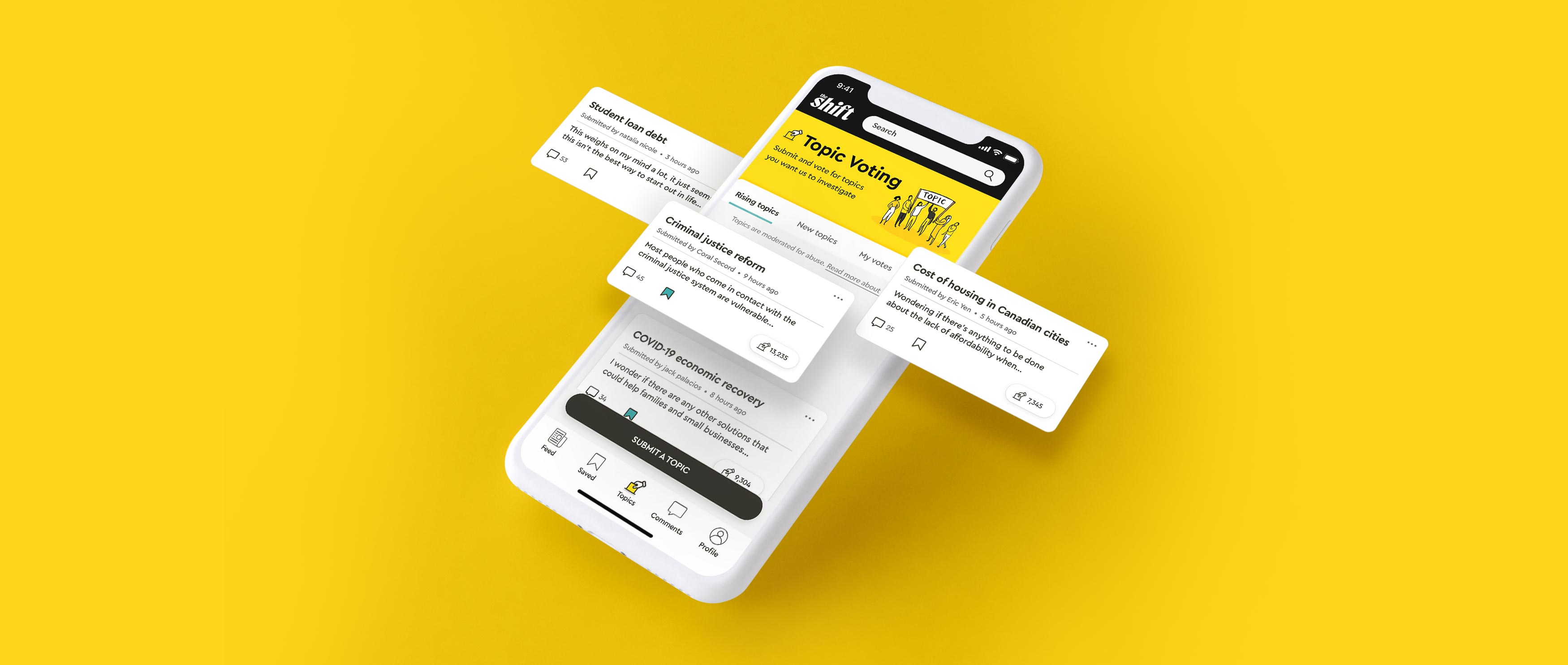
From here, I decided the app should be a platform for solutions-based stories. This would address the problem of Millennial news readers feeling hopeless while reading the news. As well, to increase audience engagement and make the process of news-making more democratic, I thought it would be interesting to add functionality that allowed users to submit and vote on the topics they wanted journalists on the platform to investigate. This might give readers more of a personal stake in the news and decrease their likelihood of disengaging.
Final user story and core task
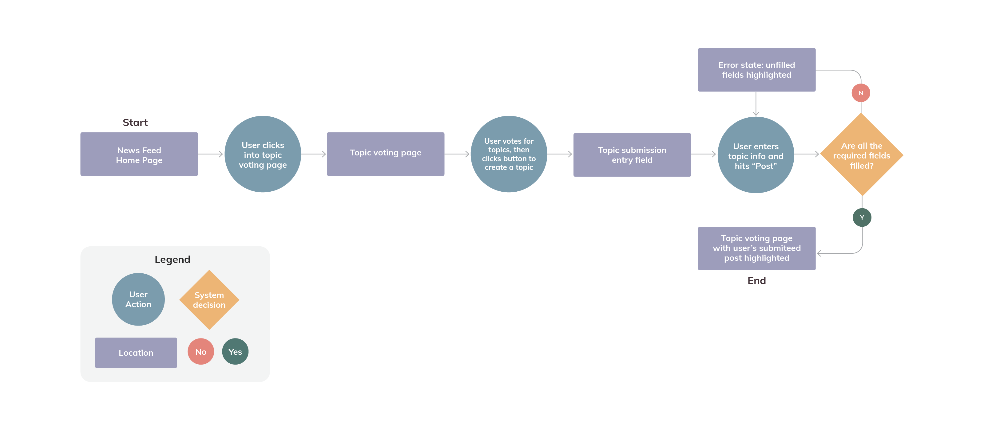
User story: As a user, I want to submit a topic for journalists to investigate so that I feel like I have a voice in the news-making process.
Core task: Submit a topic you want journalists to investigate
A new task flow was created to map out the steps within the final core task:
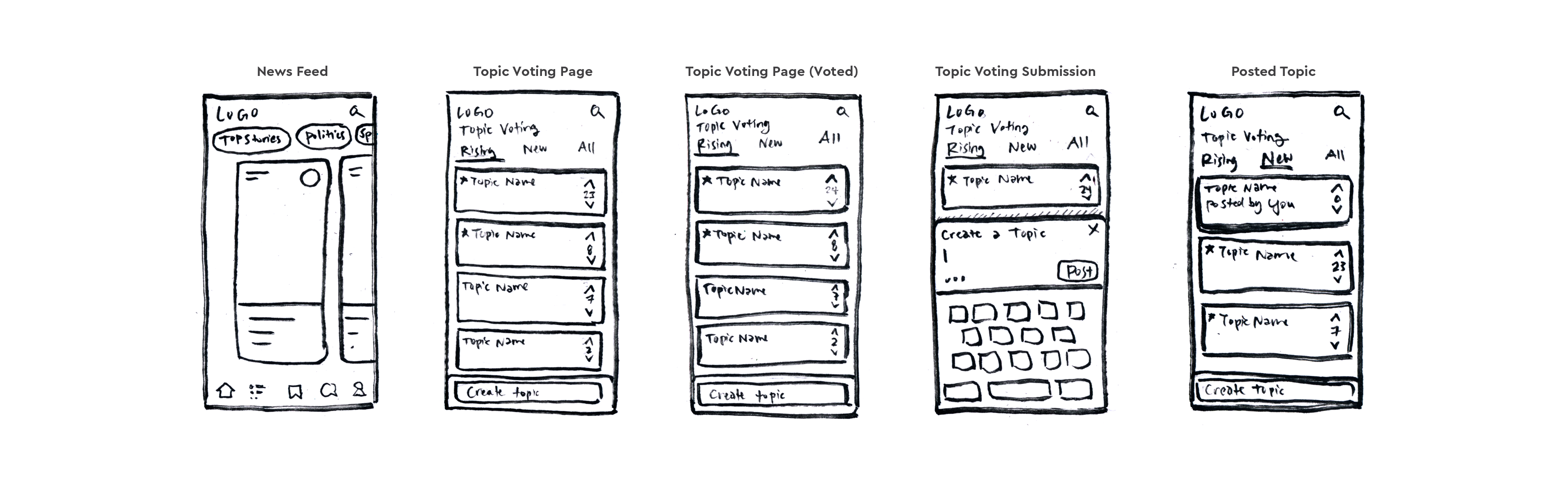
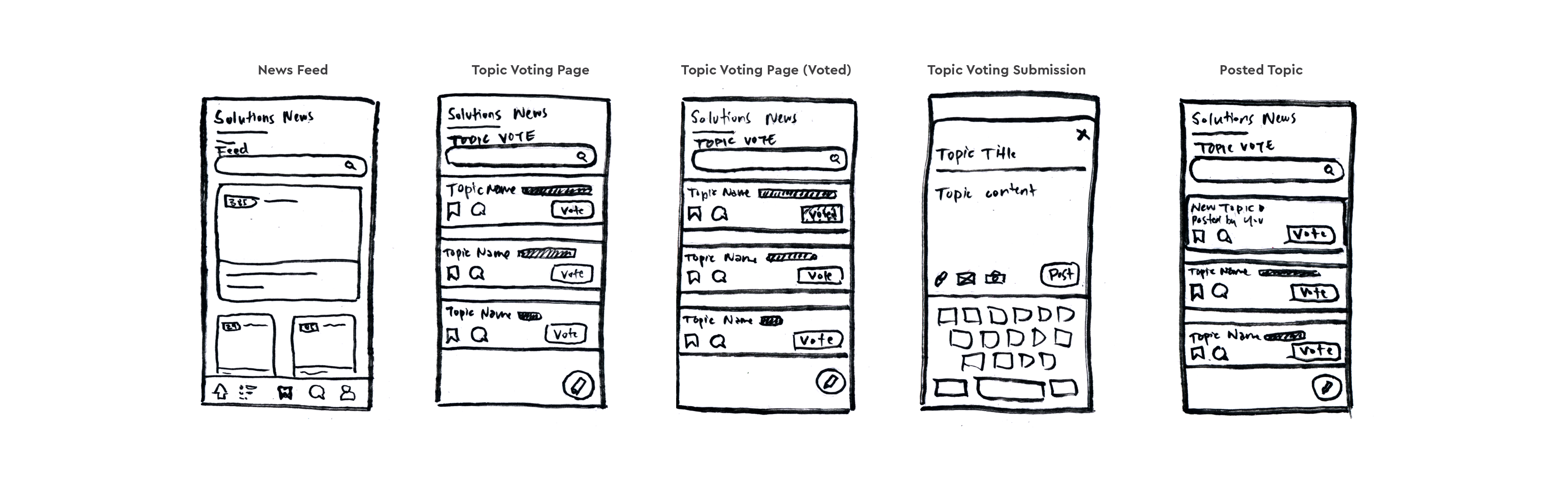
I then created multiple sketches to explore what this task might look like:
PHASE 4
Iteration
Digital Wireframes
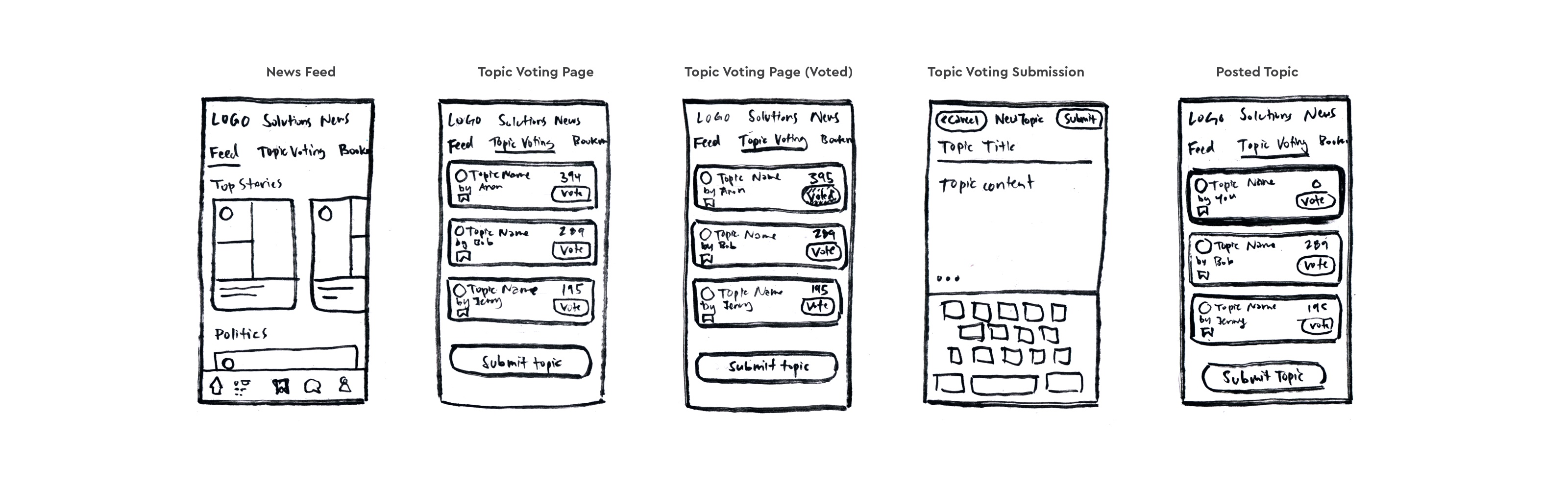
Having completed the sketches, I took elements from each and combined them to create a mid fidelity digital wireframe, which could be used for user testing:
User Testing
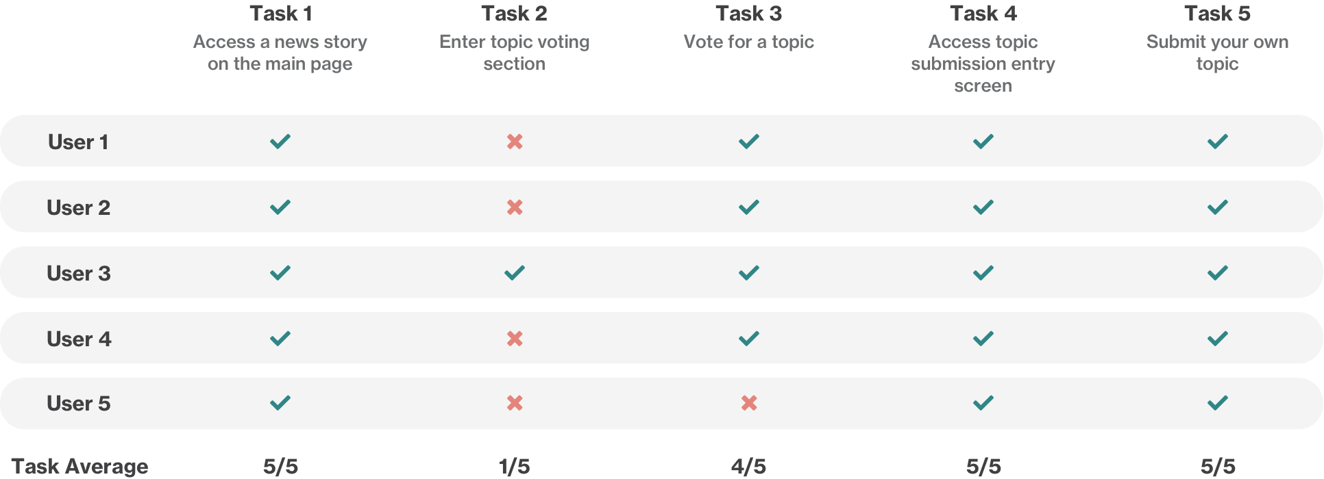
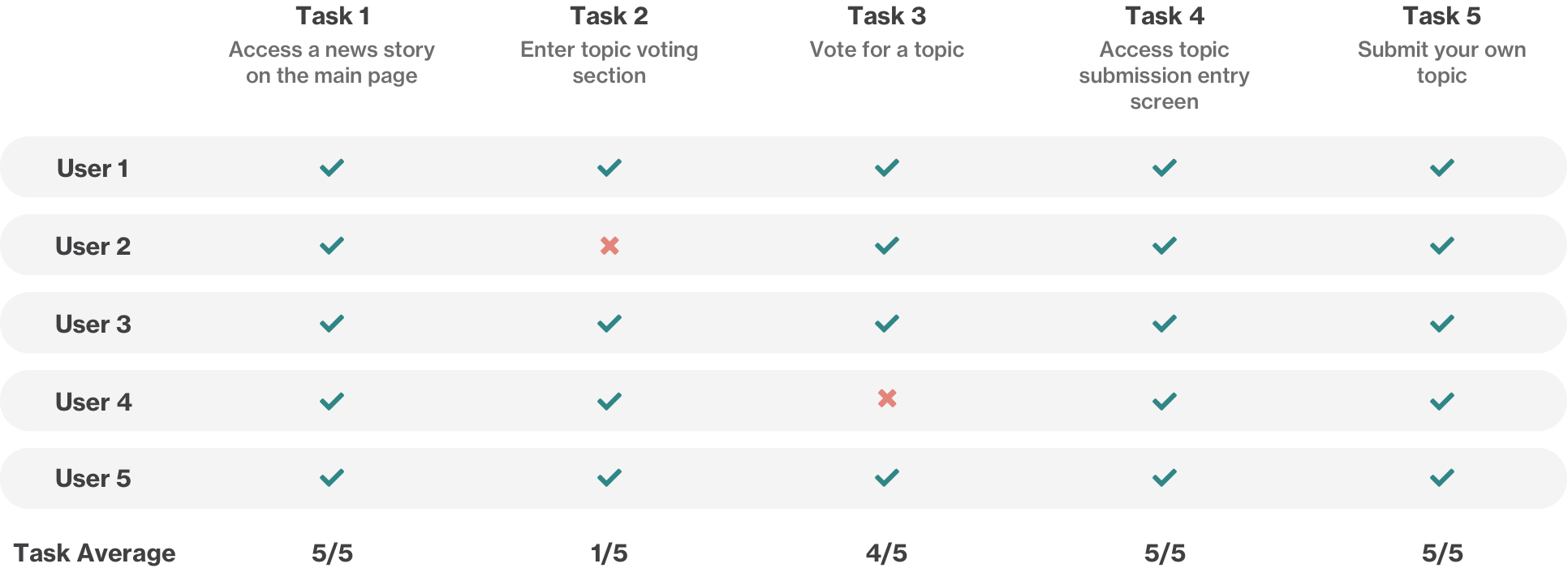
Using this digital wireframe, it was now time to test the prototype with users to get feedback on the design. Two rounds of user testing were conducted with 5 different users each time.
I broke the tasks the user should be able to complete successfully into 5 different points:
1.) Access a news story on the main page
2.) Enter topic voting section
3.) Vote for a topic
4.) Access the topic submission entry screen
5.) Submit your own topic
User testing Round 1
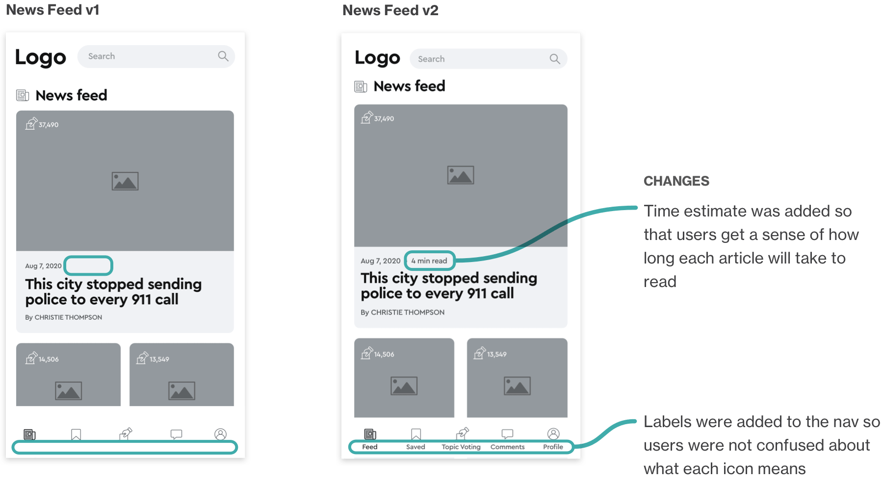
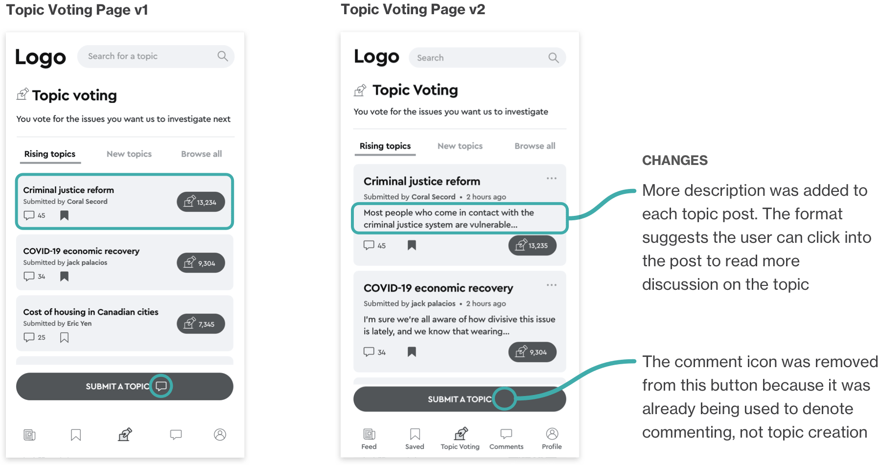
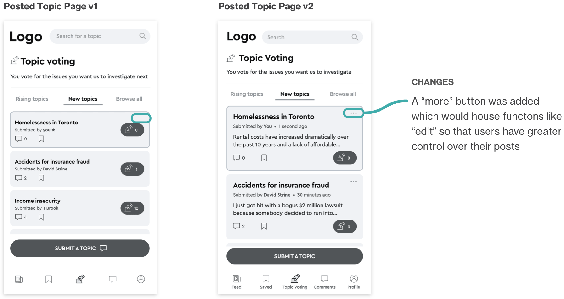
In this round, the majority of the tasks were completed successfully, however there was a lot of confusion when the users were asked to submit a topic. This was the most tricky task to understand for users because a new concept was being introduced. I realized I would need to give the users extra explanation and guidance when it came to this step.
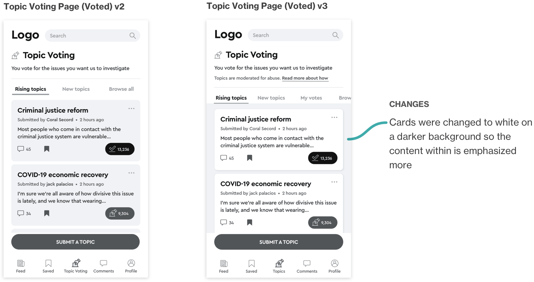
Version 1 to Version 2 Adjustments
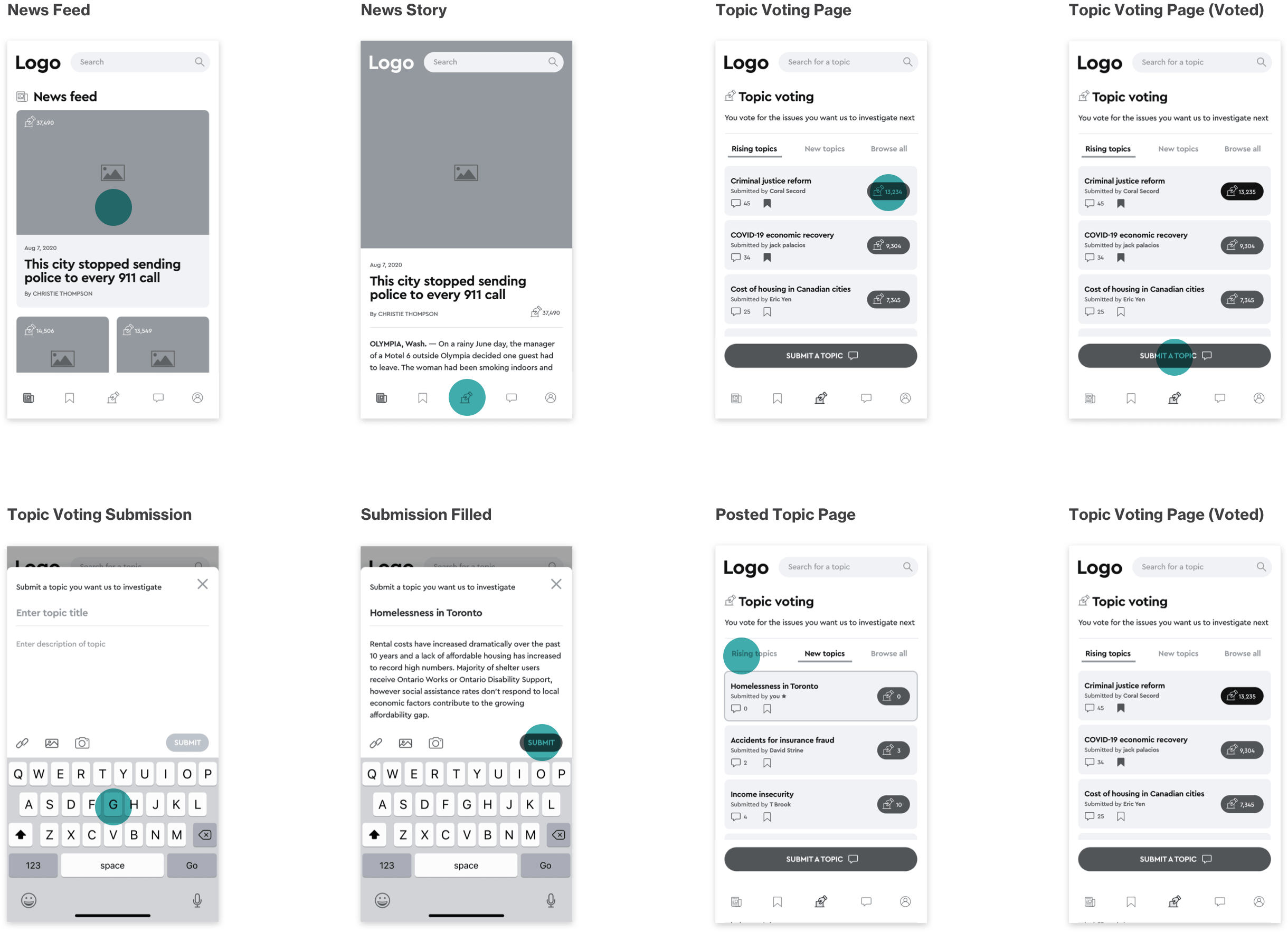
Based on the User Test Session 1 findings, changes were made to the prototype to arrive at a second improved version
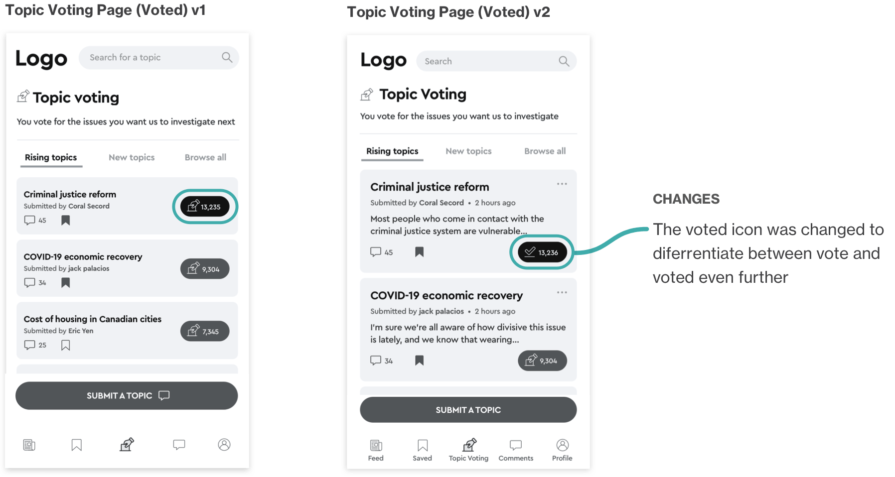
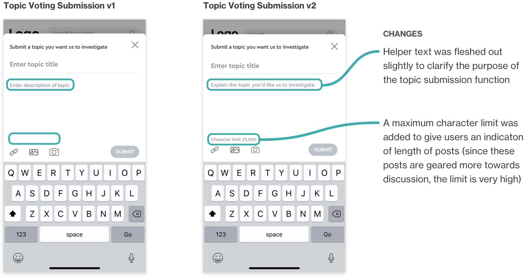
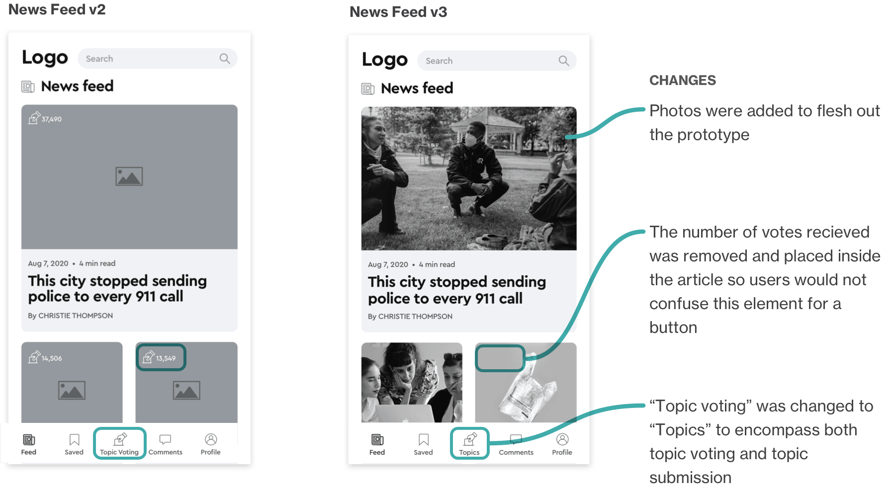
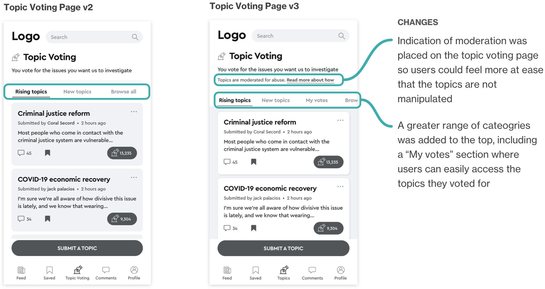
User testing Round 2
I then took the new and improved version 2 prototype into a second round of testing. This time, the majority of the tasks were completed successfully. It was easier this round for the users to understand where to go to submit a topic, but they were still slightly hesitant. Though usability was fairly smooth, the users had a variety of small suggestions that could be implemented so that they would feel more comfortable using the app.
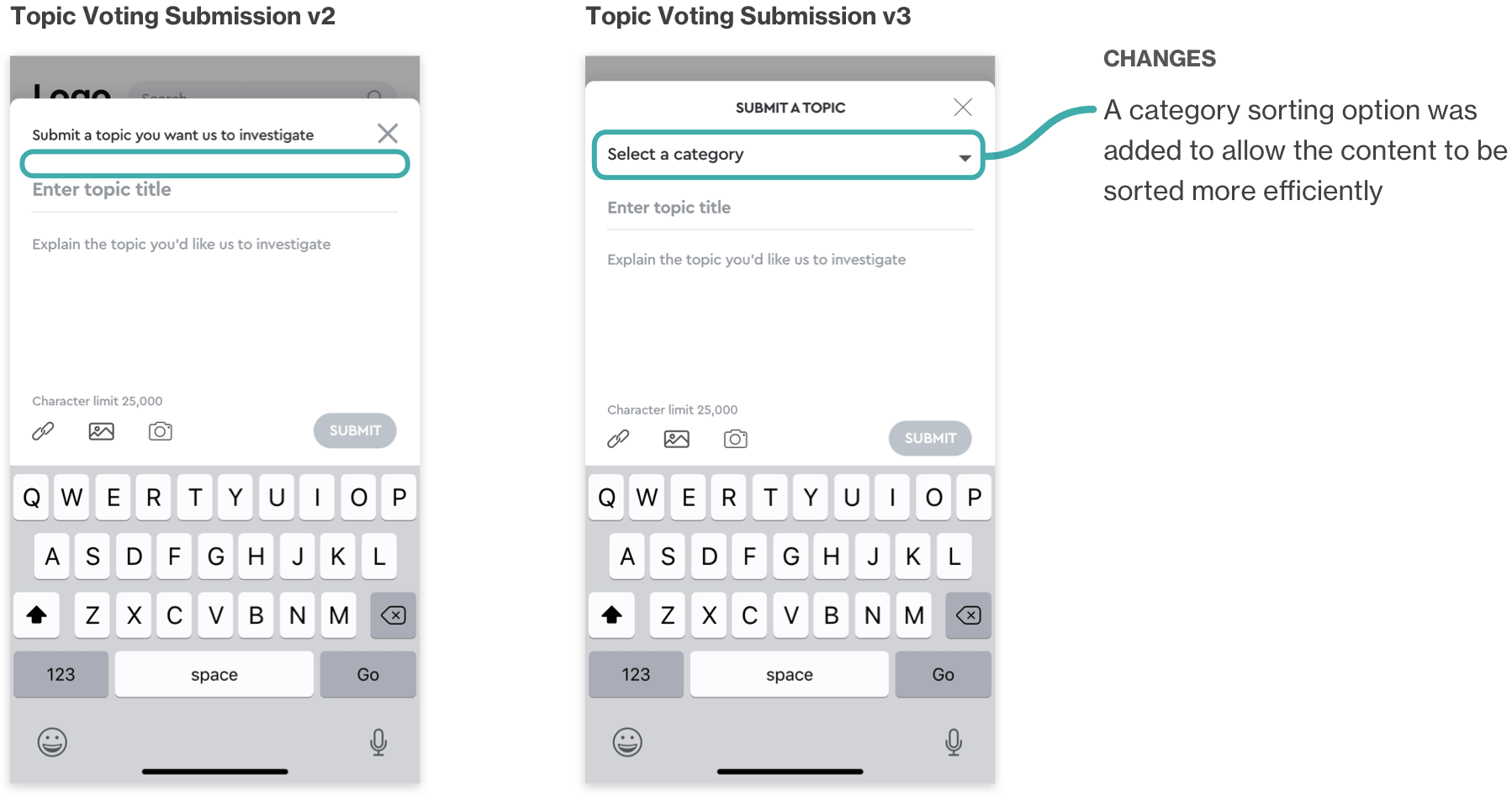
Version 2 to Version 3 Adjustments
Once again, changes were made to the prototype to arrive at a third iteration, which would then be taken into the high fidelity design of the app.
PHASE 5
Visual Identity
With the prototype tested, it was time to bring the wireframes to life by applying branding that would speak to my target user — the Millennial news reader.
I began by brainstorming adjectives that embodied the brand:
• Co-operative
• Energetic
• Expressive
• Action-oriented
• Thoughtful
• Inspiring
• Current
• Modern
• Changing
• Positive
• Constructive
• Comforting
• Familiar
• Affirmative
• Decisive
• Participatory
• Aware
• Engaged
• Helpful
• Open
• Social
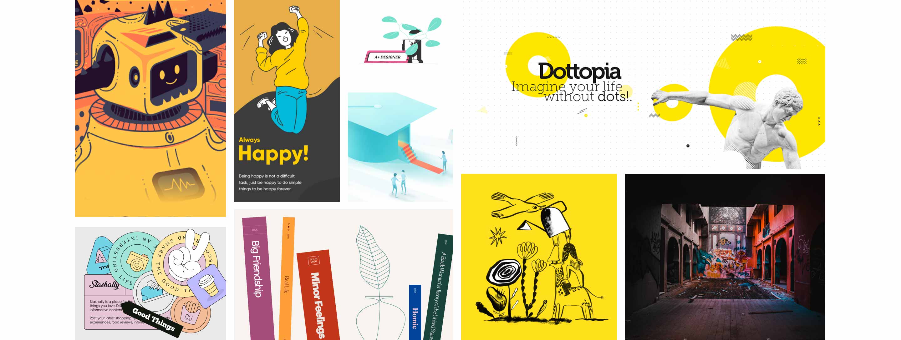
Based on these adjectives, I started to assemble images to create a moodboard, from which I extracted colours. I began experimenting with injecting these colours into my Mid fidelity layouts.
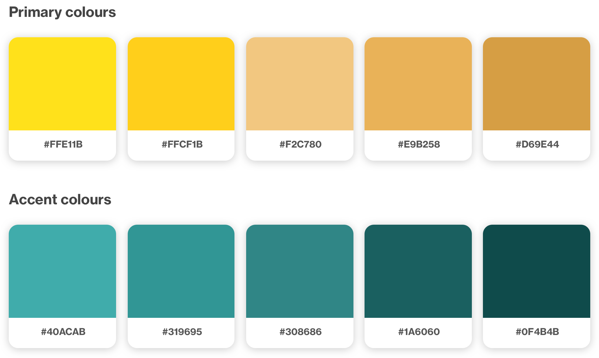
I arrived at a colour palette that spoke to the energetic and expressive aspect of the brand. The primary colour was yellow — a colour associated with optimism and youthful energy.
The secondary colour selected was a teal/green to be used for accent elements. Teal/green are colours associated with growth and progress as well as freshness.
Black and dark grey would also play a major part in the branding, particularly contrasted with white. I felt the use of a simple black and white contrast was a nod to the more traditional newspaper format.
App name
I brainstormed a number of app names (Hoster, Tally, Quantum, Delve, Scout, and more) but I ended up selecting “The Shift” after asking peers which name spoke to them.
The Shift could have multiple meanings. It suggests a shift in way we look at news and a shift towards progress. It also calls to mind the shift key on a computer. The function of making something uppercase suggests blasting out a message with more emphasis - a good symbol for amplifying the voices of news readers.
Wordmark
The app name was then taken into sketches and digital exploration. I tried a number of treatments. I wanted to make sure to include an upward-facing arrow somewhere within the wordmark to maintain the shift key connotation and also to suggest upward progress.
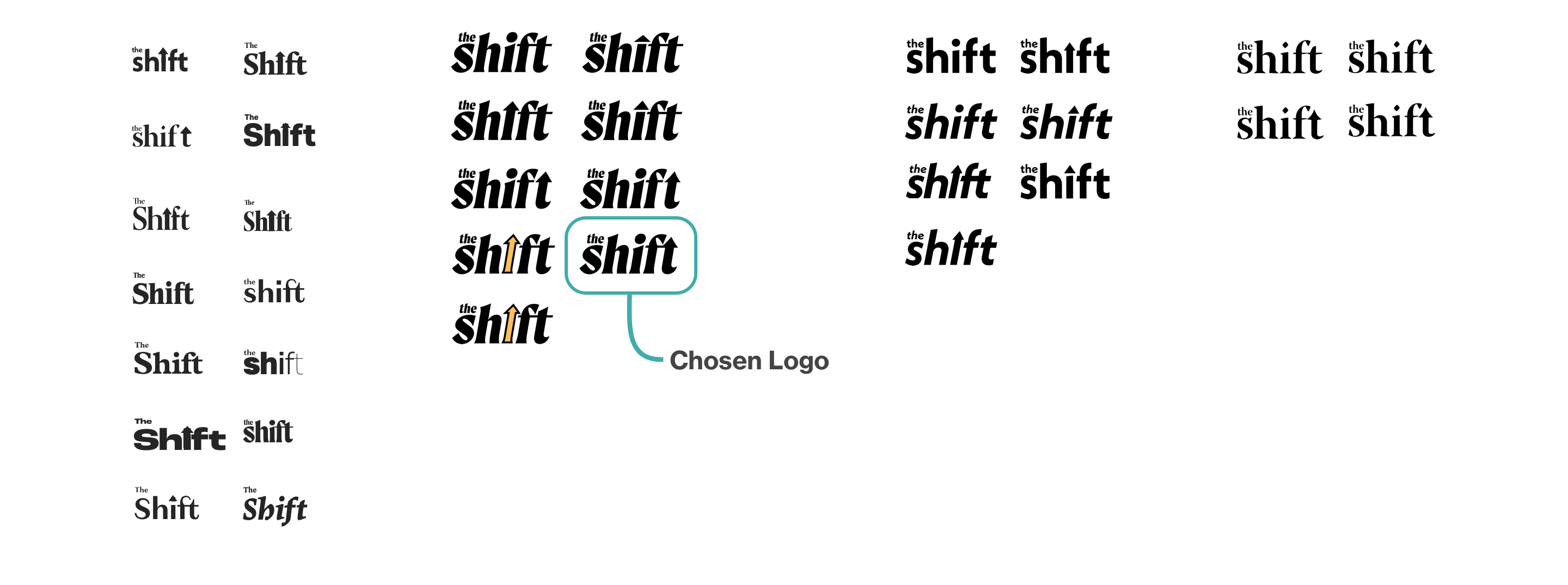
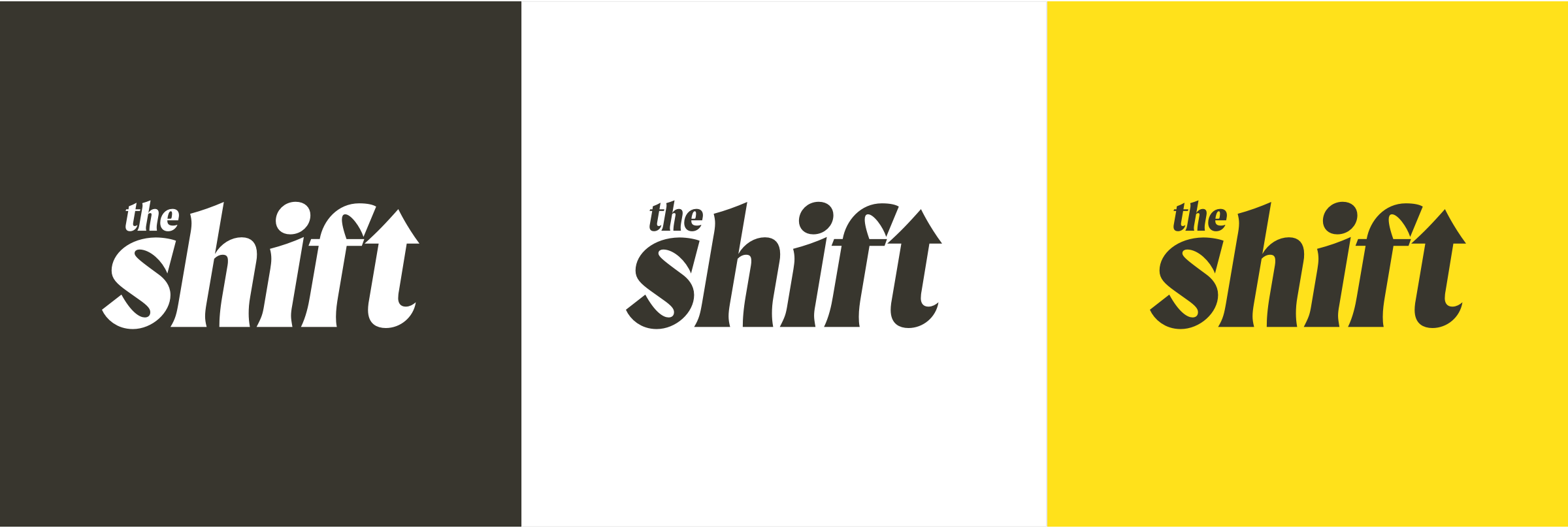
A final selection was chosen, which uses the font Moret. I felt the use of modernized serif font was a callback to the traditional newspaper, but with an updated feeling. I chose an italicized version to suggest forward movement.
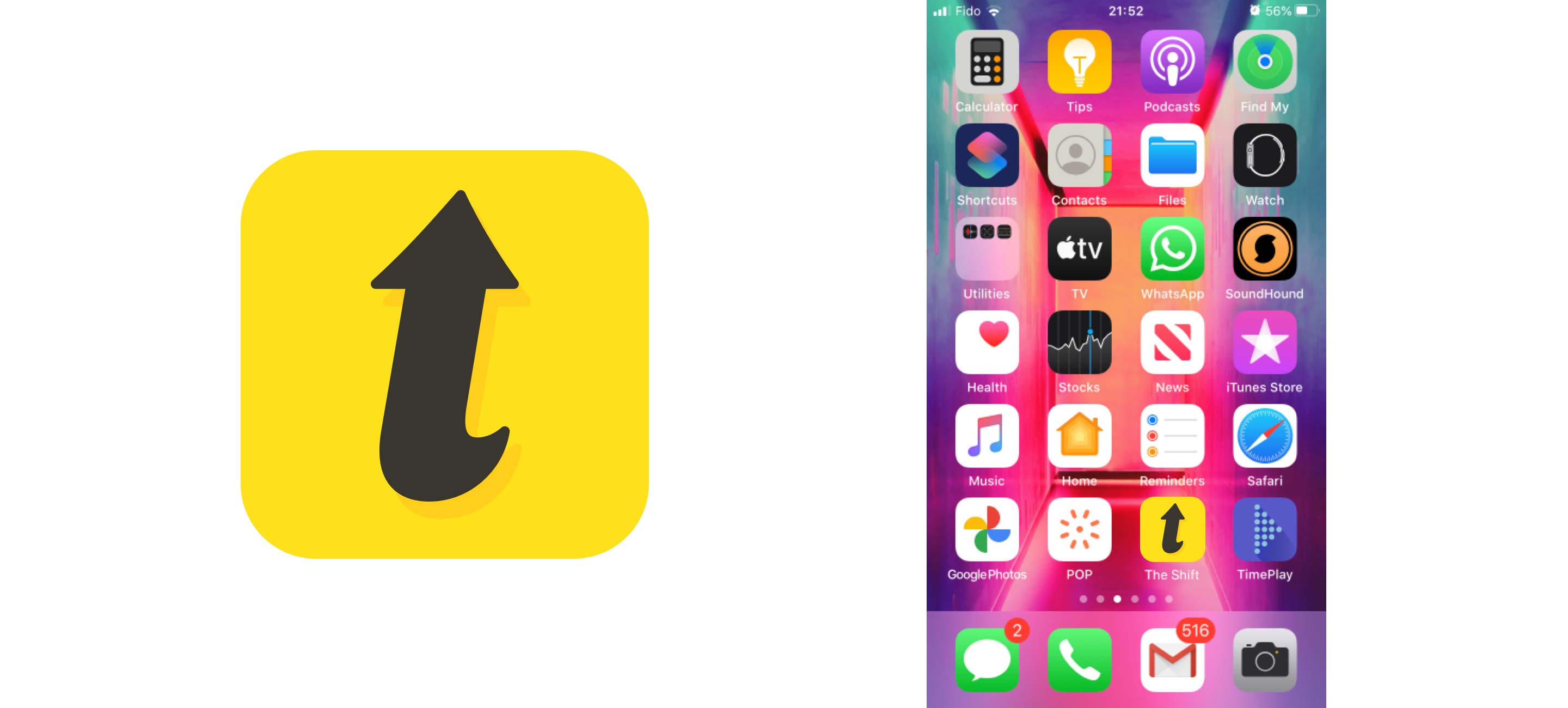
Logo and App Icon
The arrowed “t” from the wordmark was extracted to be used as the app icon. The arrow works as a standalone image suggesting progress, while also maintaining a reference to the wordmark.
Iconography
The icons chosen were a mix of downloaded icons and ones that I had created. To align them all, I standardized their stroke weights and re-designed a few where necessary. For active states, I made sure to take the opportunity to inject the chosen brand colours to make them feel truly integrated with the rest of the app
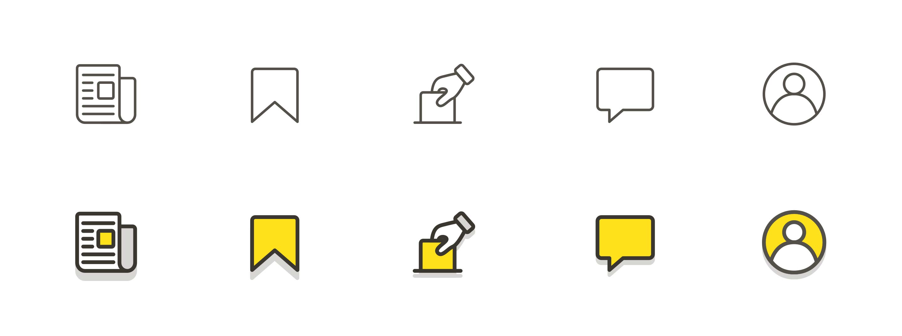
Voting icon source Pixel perfect
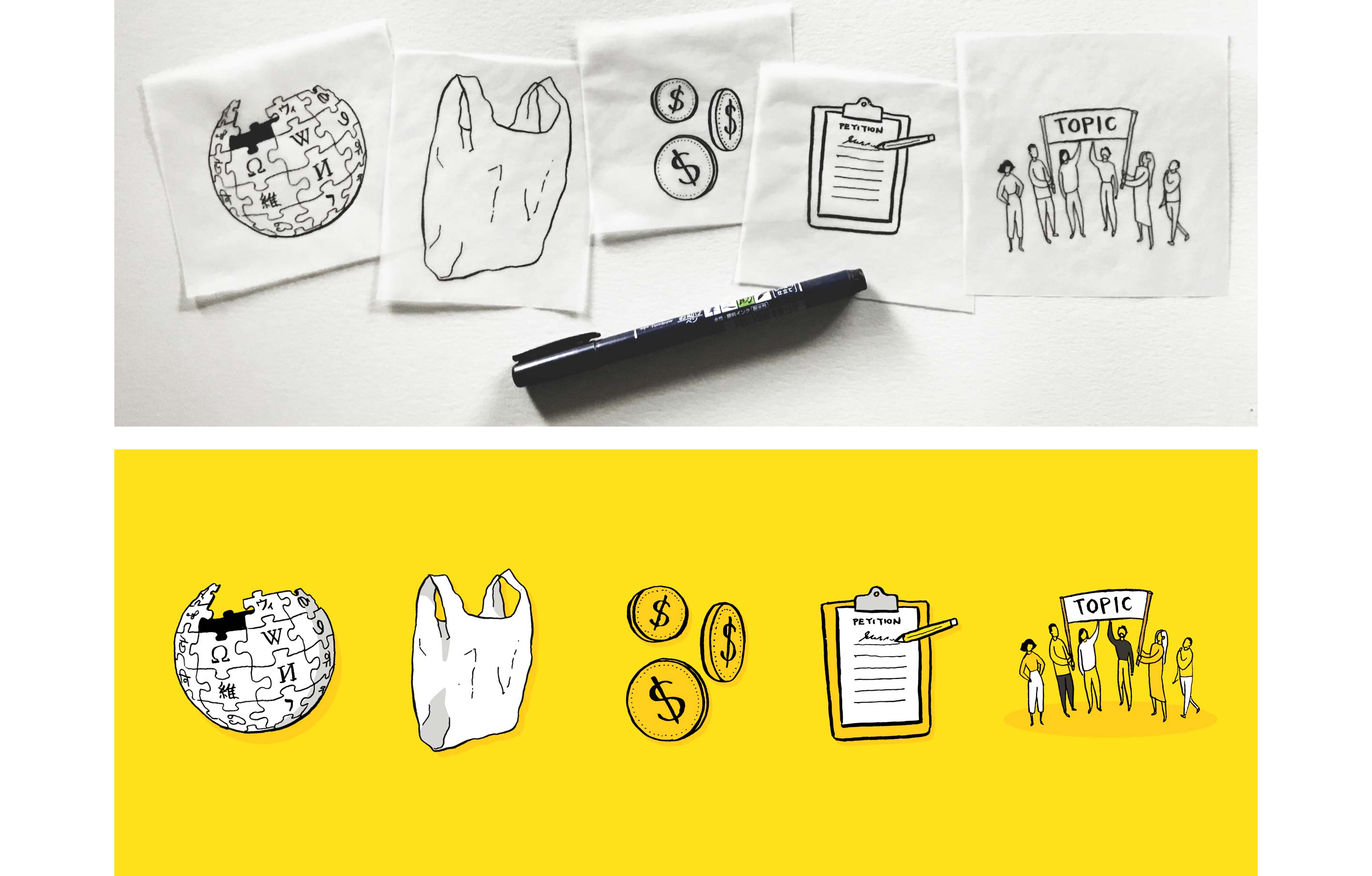
Brand illustrations
To take the branding a step further and give the app a truly unique feeling, I decided to create a series of illustrations that could be used throughout the app — as article hero images, header or icons.
Since the app was in part about self expression, I wanted some evidence of a human touch in the illustration style. I decided to hand draw the outlines of the illustrations to maintain that human element, scan them, and inject the chosen brand colours.
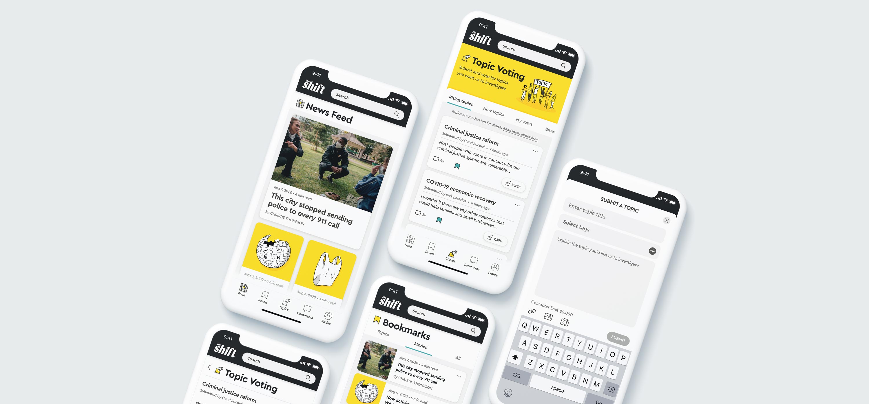
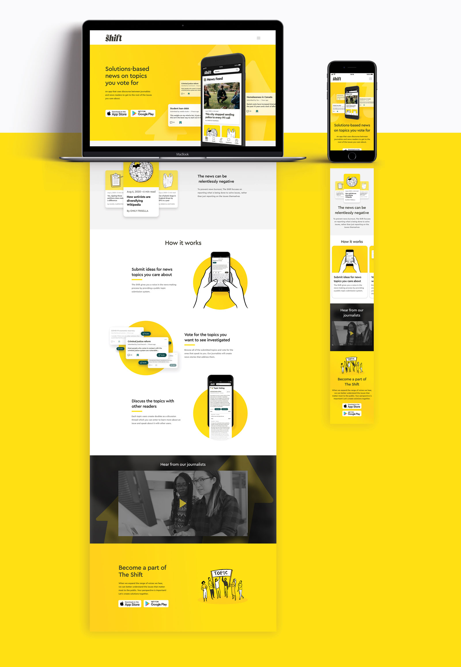
High Fidelity Design
Finally, all branding elements were injected into the screen to arrive at a fully realized look and feel.
Product marketing site
A product marketing site was then created to clearly communicate the value proposition to potential customers. Through this website, I wanted to ensure that users understood the basic premise of the app and the key features. I also wanted users to clearly get a sense of the branding and feel of the app at a glance before downloading it.
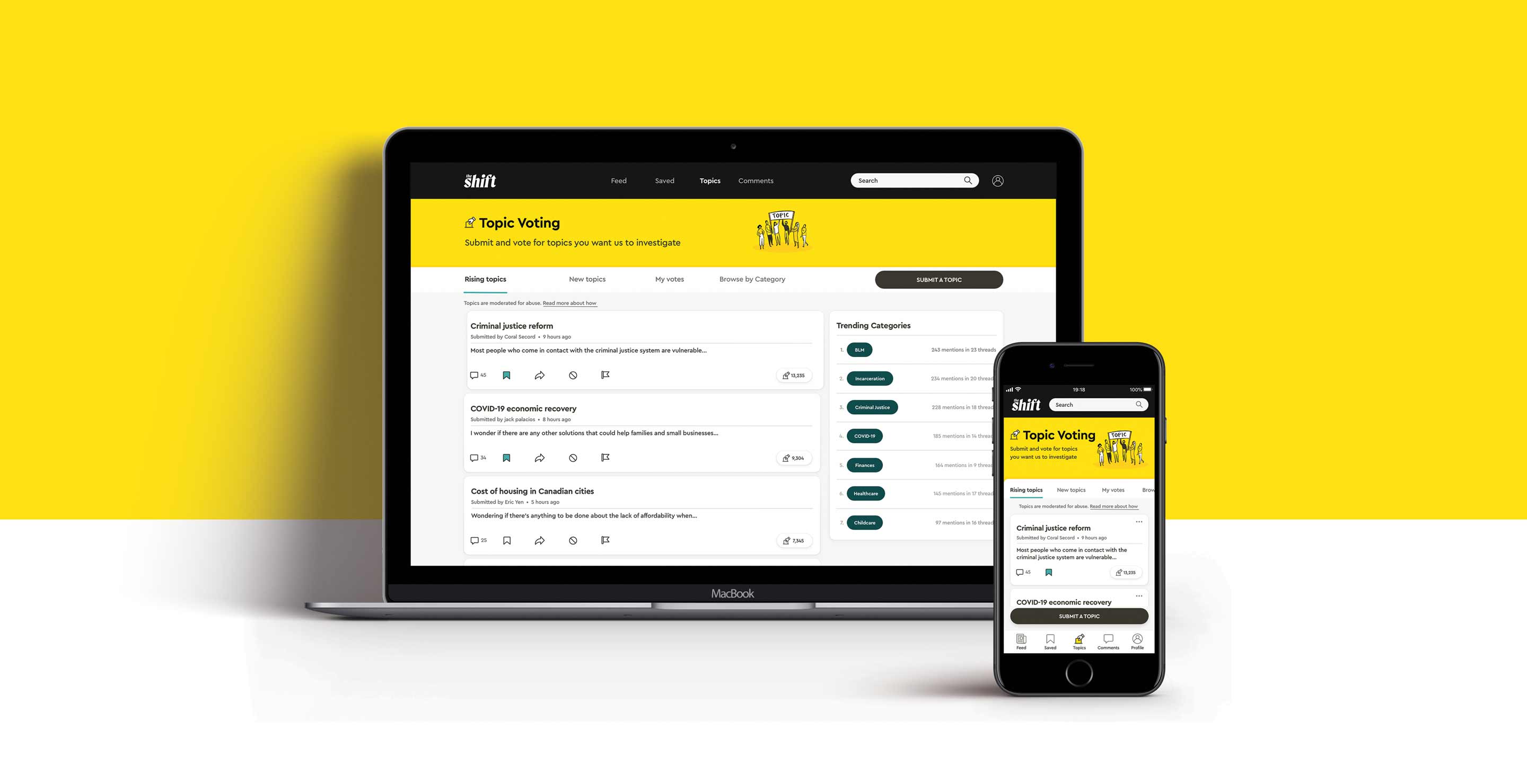
Multi-platform challenge
We were then asked to consider an alternative platform for our app to expand our thinking outside of the mobile framework. I had to think about what other device would suit not only the logistic needs of reading long format articles and discussion threads, but also consider what platform my target millennial user would be most likely to use aside from their phones.
I reasoned it would be most logical to take it to a tablet or laptop considering the article format. After asking peers which of the two devices they preferred for reading news articles aside from mobile, 5 out of 6 people answered laptop - the choice was clear.
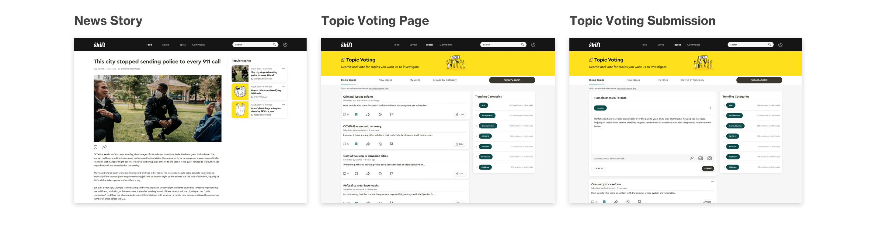
I took the design elements from the mobile app and created a desktop version of the In-article screen, the topic voting page and the topic submission screen:
CONCLUSION
Learnings and Next Steps
Design Impact
As designers, it’s important to consider the impact our work has on the world and to contemplate any unintended consequences our ideas might have, despite our best intentions. In order to consider this, I used the Tarot Cards of Tech — a system of provocations created to help designers think about the impact of technology.
The card “The Scandal” helped me to understand what could happen if things did’t quite go as planned:
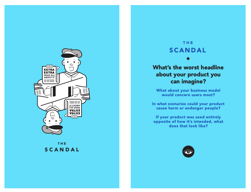
What’s the world headline about your project you can imagine?
“Trolls band together to mass submit bogus topic submissions to The Shift news app”
What about your business model would concern users the most?
Users could be concerned that the topic submission and voting platform could be trolled or spammed with phoney or hateful topic submissions. This could be combated by ensuring there is moderation of topics.
In what scenario could your product cause harm or endanger people?
If bogus topics were created, this could skew the type of news stories being produced on the platform. The issues that arise in the news can affect people’s lives and people’s awareness of what’s going on around them, so this could cause harm.
If your product was used entirely opposite of how it’s intended, what does that look like?
If users don’t take that topic submission feature seriously, it could affect the credibility of the news source. That’s why it’s crucial that there be moderation of topics within the app.
Next Steps
Given more time, there are plenty of opportunties to add more to the app:
Add funtionality that enables the organization of community projects
In order to really make a posititive impact, it would be great to be able to help users take action in their local communities while connecting with other users
Add more ability to categorize and filter topics
Users should be able to quickly access topics they care about and follow categories that they're interested in without having to use the search bar
Add a greater level of personalizaton and build out profiles
The app could expand into a more social realm that enables connection by the addition of personal pages that others can visit, direct messages and profile pictures
Key Project Learnings
Staying agile
Throughout the design process, I had to pivot more than once in response to users’ needs and to ensure that I was creating a compelling product. I learned it’s important to stay open-minded throughout the process and to not get too attached to an idea.
Learning from others
I found conducting user interviews and user testing to be one of the most fascinating parts of the process. I discovered some of the assumptions I had made were totally wrong — but for the better. I learned things from my users that not only allowed me to adjust my app, but on a more general level opened my mind up to some different perspectives. It allowed me to view the user not as just some faceless entity, but as real people with very interesting things to say.
Thank you for your time!
If you’re interested in chatting about this project or UX design in general, don’t hesitate to reach out to me on LinkedIn
UX/UI AND GRAPHIC DESIGN